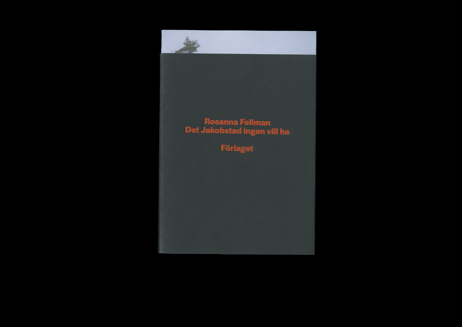
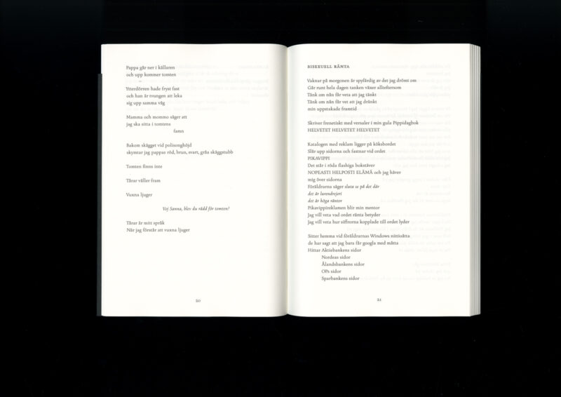
Rosanna Fellman
Det Jakobstad ingen vill ha
- Format 146 × 210 mm
- Pages 140
- Printing Meedia Zone
- Paper Munken Print Cream, Multioffset, Olin Black
- Typefaces Briefcase Type Foundry BC Figural, Darden Studio Halyard Display, Darden Studio Halyard Text
- Published by Förlaget
- Design Tom Backström
- Photography Jennifer Granqvist
At first glance, the book’s design appears simple. The black band on the cover both conceals and, almost forcefully, reveals the rugged Ostrobothnian landscape peeking out beneath it. The colourful author’s portrait on the back cover also awaits discovery. Removing the band creates an intriguing undercurrent to the work, which begins to unfold before the reader even starts the text.
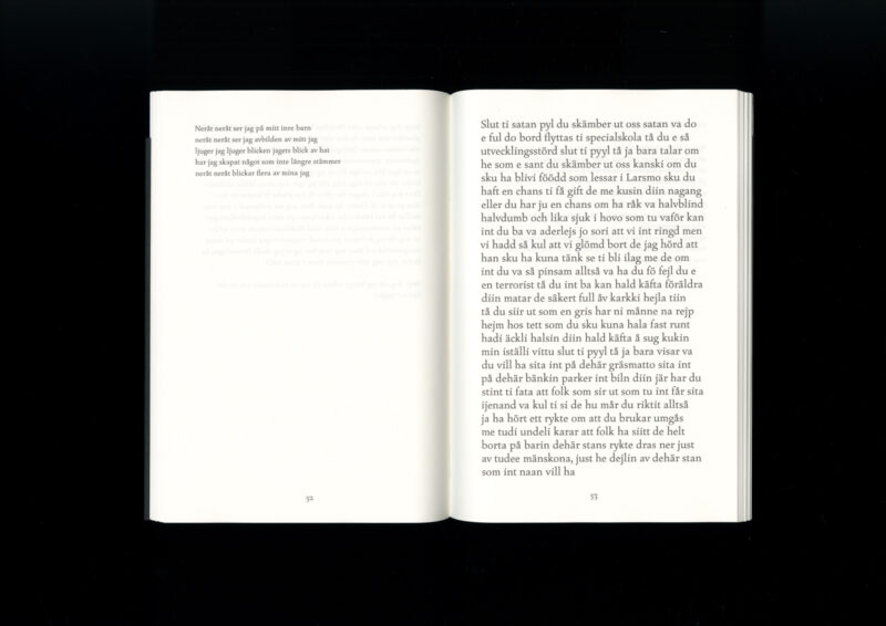
Jaakko Yli-Juonikas
Tuhatkaunokin tuho
- Format 210×297 mm
- Pages 560
- Printing and binding Otavan kirjapaino
- Paper Novel 2.0
- Typefaces Adobe Caslon Pro, Apparat, Arial, Base 12 Sans, CMU Bright, CMU Serif, Calibri, Cardo, Change, Courier, EB Garamond, Fira Sans, Franklin Gothic, Freehouse, Freight Text, Futura, Georgia, Gill Sans, HWT Aetna, Helvetica, Monotype Grotesque, Mostra Nuova, Mrs Eaves, Nimbus Sans, Noteworthy, Noto Sans, Roboto, Source Sans, Spectral, Tahoma, Times New Roman, Trade Gothic, TT Hei CHS, Verdana, Warnock Pro
- Published by Siltala
- Design Katri Astala
An epic challenge for both the designer and the writer. The work combines, borrows, and juxtaposes countless visual languages from the author’s previous works, the depths of the internet, as well as self-published literature. The reader is left wondering about the creation process of the book — how did it come together, and how does it keep itself together?
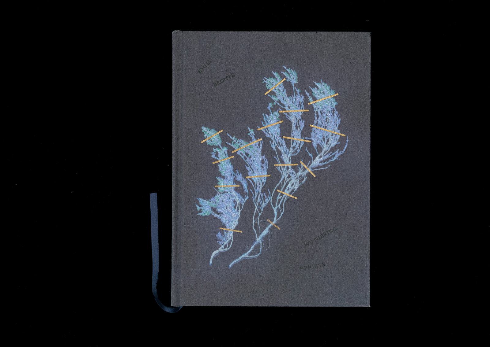
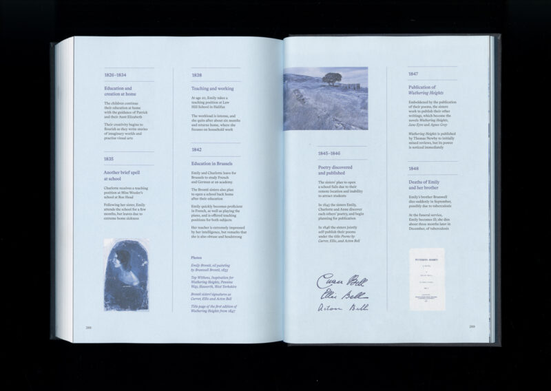
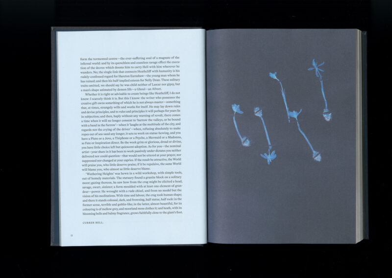
Emily Brontë
Wuthering Heights
- Format 170 × 240 mm
- Pages 312
- Printing Printon
- Paper Munken Print White
- Typefaces Bradford
- Published by Aatos Editions
- Design Anna-Mari Tenhunen
- Reproduced by Asko Rokala
The mystery of the cover is enchanting. From the midnight blue cover, a chained piece of nature emerges, captured in the form of a nostalgic herbarium plant. The plant takes centre stage as a symbol, leaving typography in a supporting role. The silky cover material elegantly evokes the era of the story. The thoughtfully chosen colour scheme and the balanced page layout create a beautiful and captivating book.
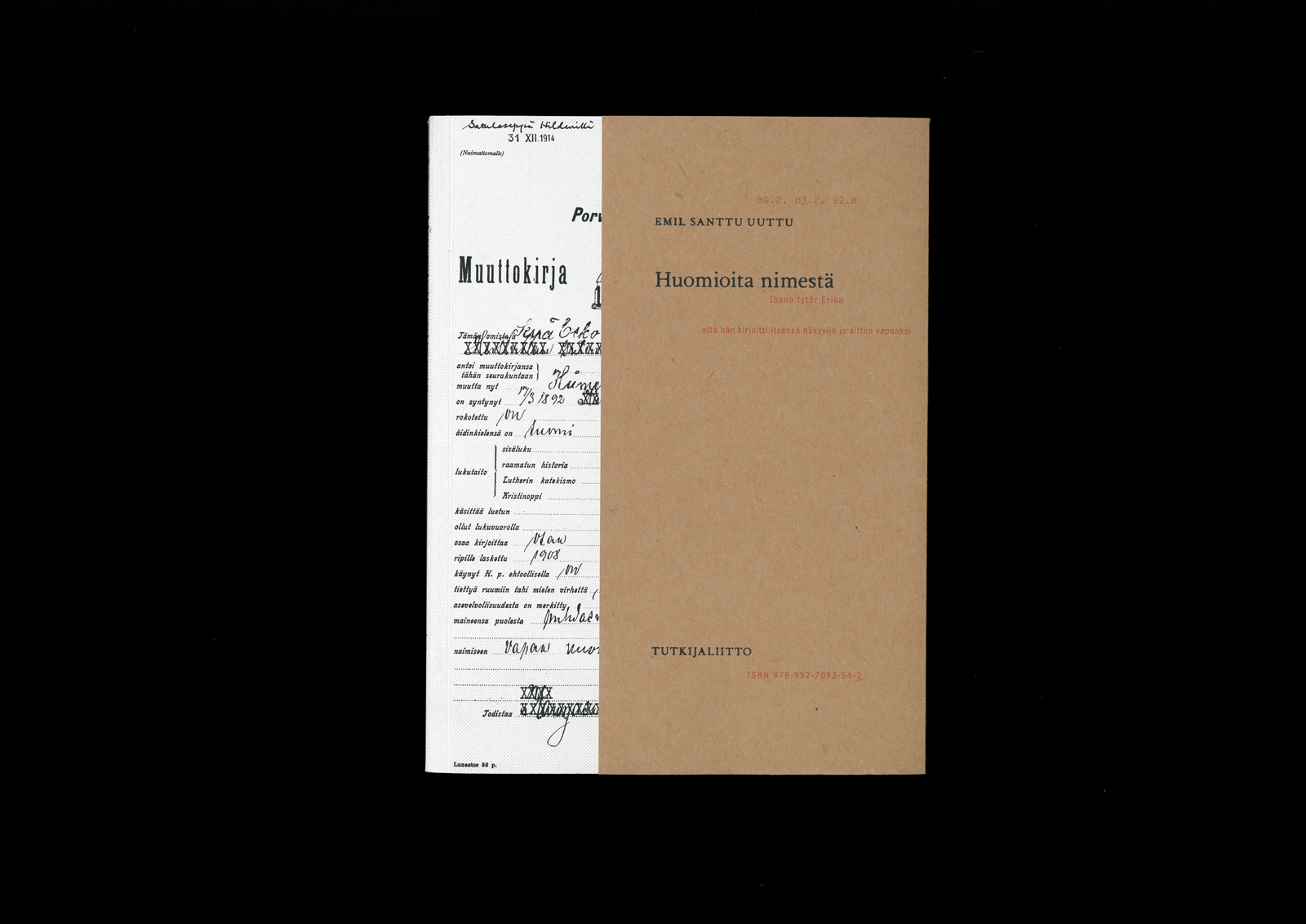
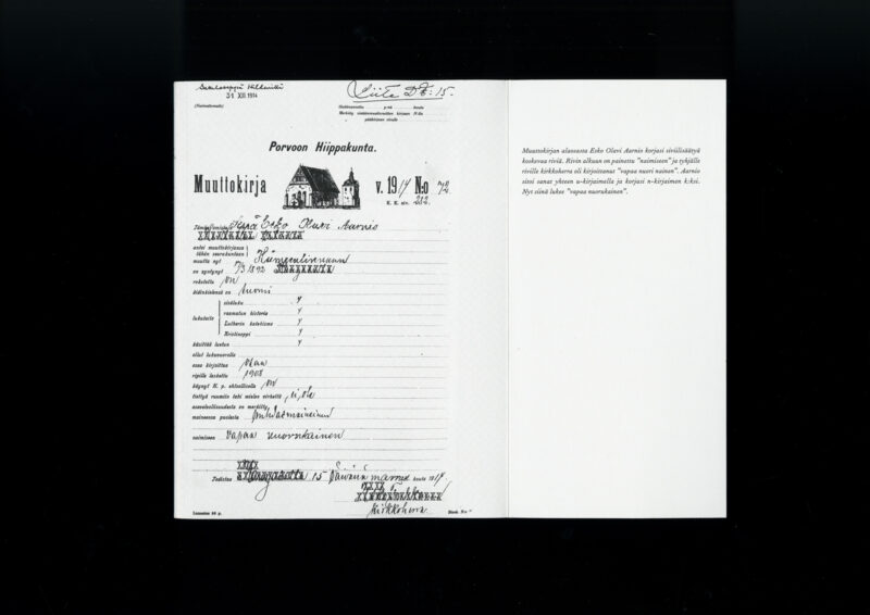
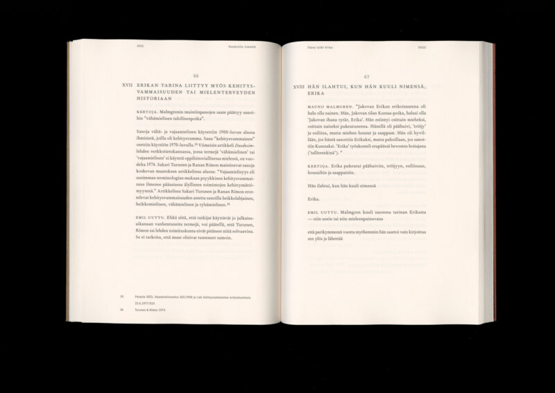
Emil Santtu Uuttu
Huomioita nimestä
Ihana tytär Erika /
että hän kirjoitti itsensä näkyviin ja sitten vapaaksi
- Format 165×220 mm
- Pages 143
- Printing and binding Printon
- Paper Holmen Book Cream, Custom Kote
- Typefaces Fournier MT Std, Bell Centennial Std, Erica Type
- Published by Tutkijaliitto
- Design Samuli Saarinen
Combining drama, essays, and archival sources, this softcover book excels in its simplicity. The typographic design and use of space create a calm, immersive environment that a polyphonic text truly requires. The front flap, which opens over the spine, creates interesting connections between materials and eras.