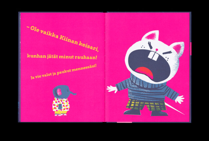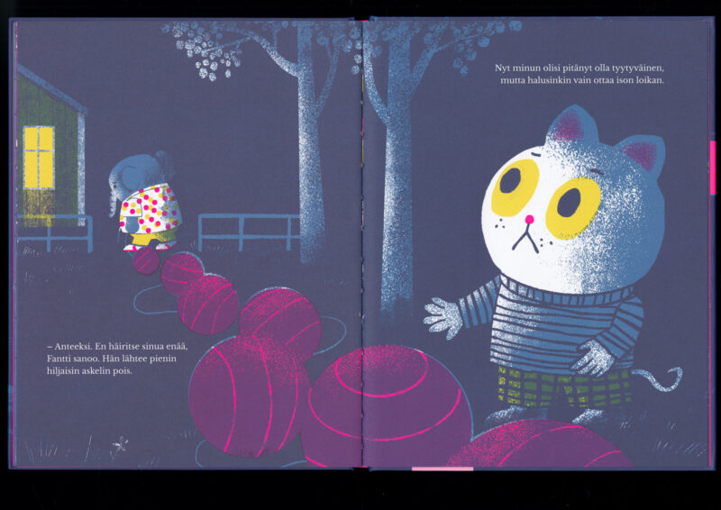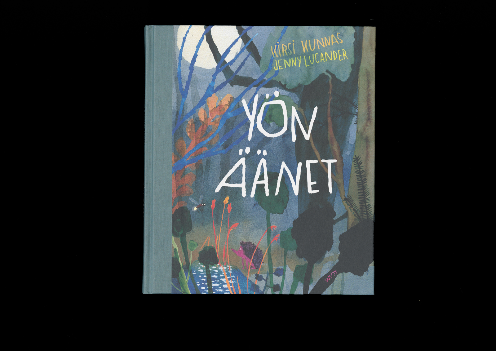
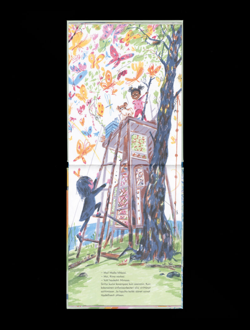
Kirsi Kunnas – Jenny Lucander
Yön äänet
- Format 200 × 230 mm
- Pages 72
- Printing Livonia Print
- Paper Magno Natural
- Typefaces Miller Text
- Published by WSOY
- Design Jenny Lucander
- Illustration Jenny Lucander
A balanced, elegant, and expertly executed book, crowned by abundant and dynamic illustrations. The colour scheme guides the reader from dark to light and from rich to pale tones. The diversity of the colour palette stays admirably controlled in the overall composition. Material choices enhance the reading experience, and the handwritten sections give the book a beautifully refined touch.

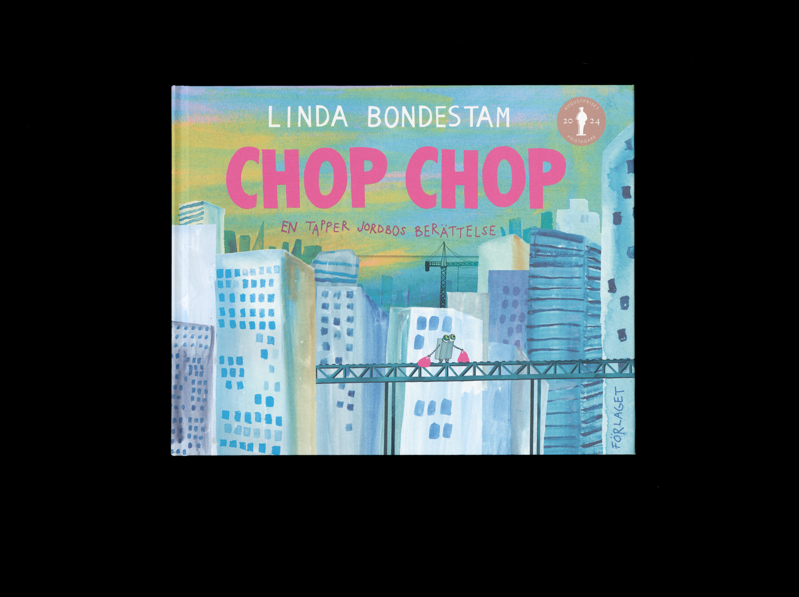
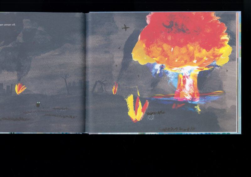
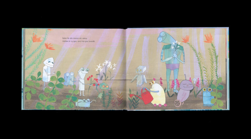
Linda Bondestam
Chop Chop – En tapper jordbos berättelse
- Format 260 × 210 mm
- Pages 80
- Printing Jelgavas Tipogrāfija
- Paper Serixo
- Typefaces Thonburi
- Published by Förlaget
- Design Linda Bondestam
- Illustration Linda Bondestam
The book’s size and choice of materials do justice to the insightful illustrations, which play a central role in the storytelling. The illustrations explore different visual narrative techniques in a diverse and deliberate way. An element of surprise carries through the entire book. Apart from the effect varnish on the cover, the book has a matte finish throughout, creating a calm reading experience.
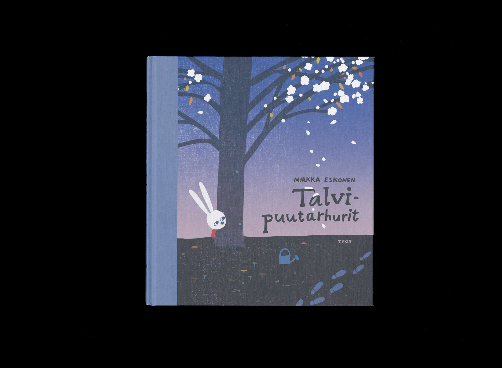
Mirkka Eskonen
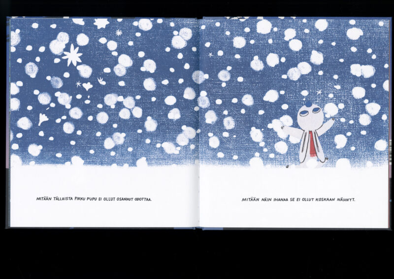
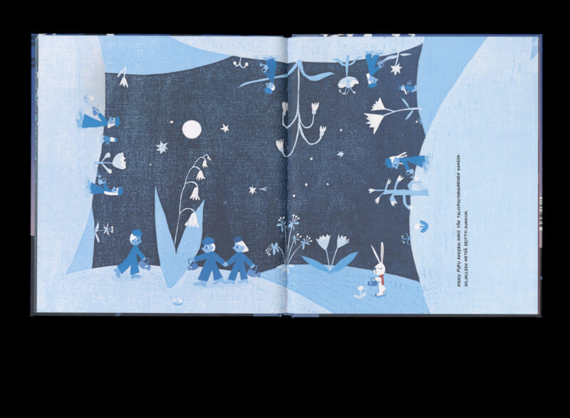
Talvipuutarhurit
- Format 210 × 230 mm
- Pages 36
- Printing Meedia Zone
- Paper Munken Lynx
- Typefaces N/A
- Published by Teos
- Design Mirkka Eskonen
- Illustration Mirkka Eskonen
- Reproduced by Petri Kuokka / Aarnipaja
A beautiful and calm composition. The style and colour palette of the illustrations captivate with their magical feel. The illustrations are boldly arranged: the horizon running through the book is placed on the outer edge of one spread, making page-turning an engaging experience. The character design is minimalistic and thoughtful. The choice of type, resembling handwritten text, works well.
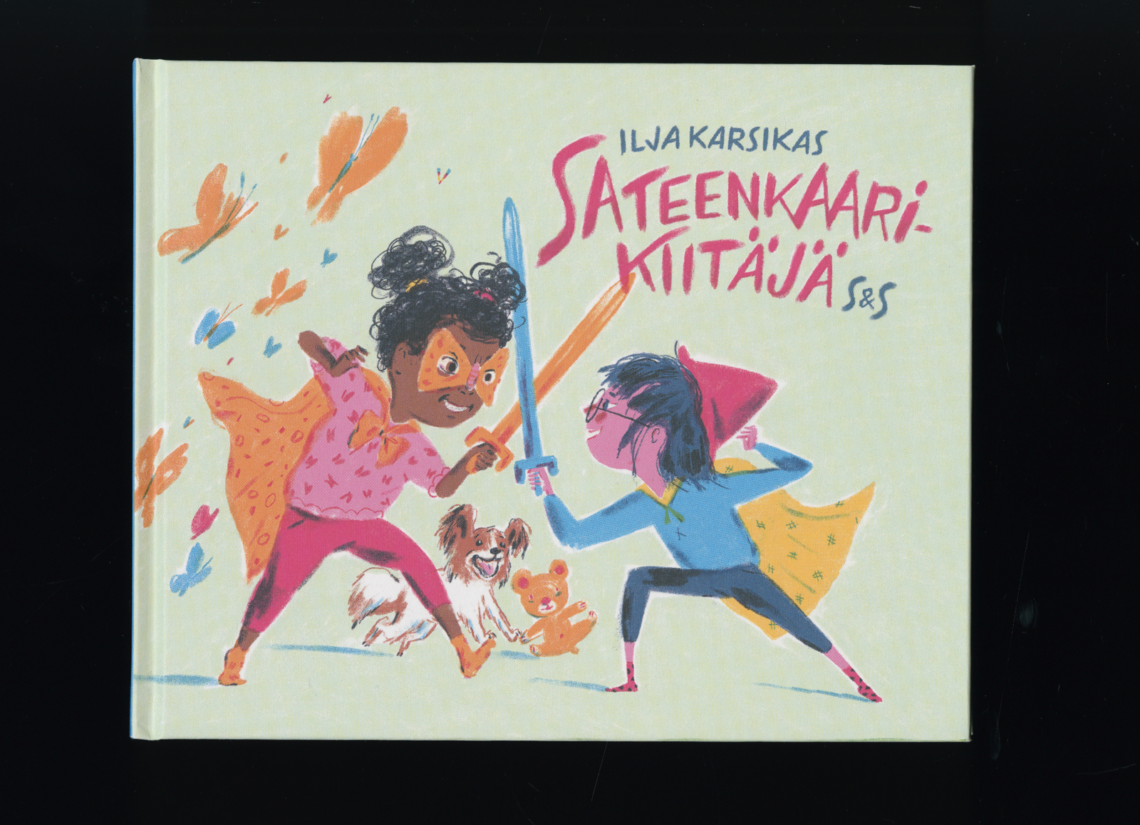
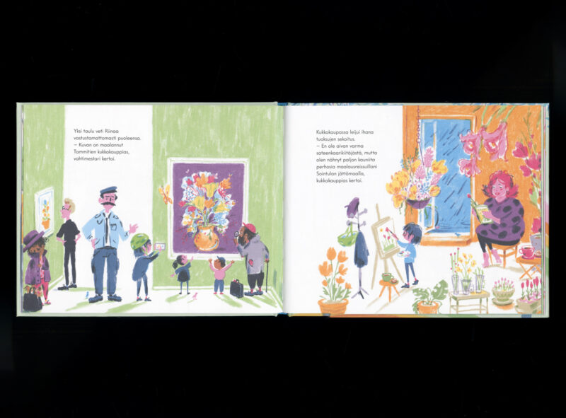
Ilja Karsikas
Sateenkaarikiitäjä
- Format 240 × 192 mm
- Pages 36
- Printing Jelgavas Tipogrāfija
- Paper Munken Lynx Rough
- Typefaces Intervogue Soft
- Published by Kustantamo S&S
- Design Ilja Karsikas
- Illustration Ilja Karsikas
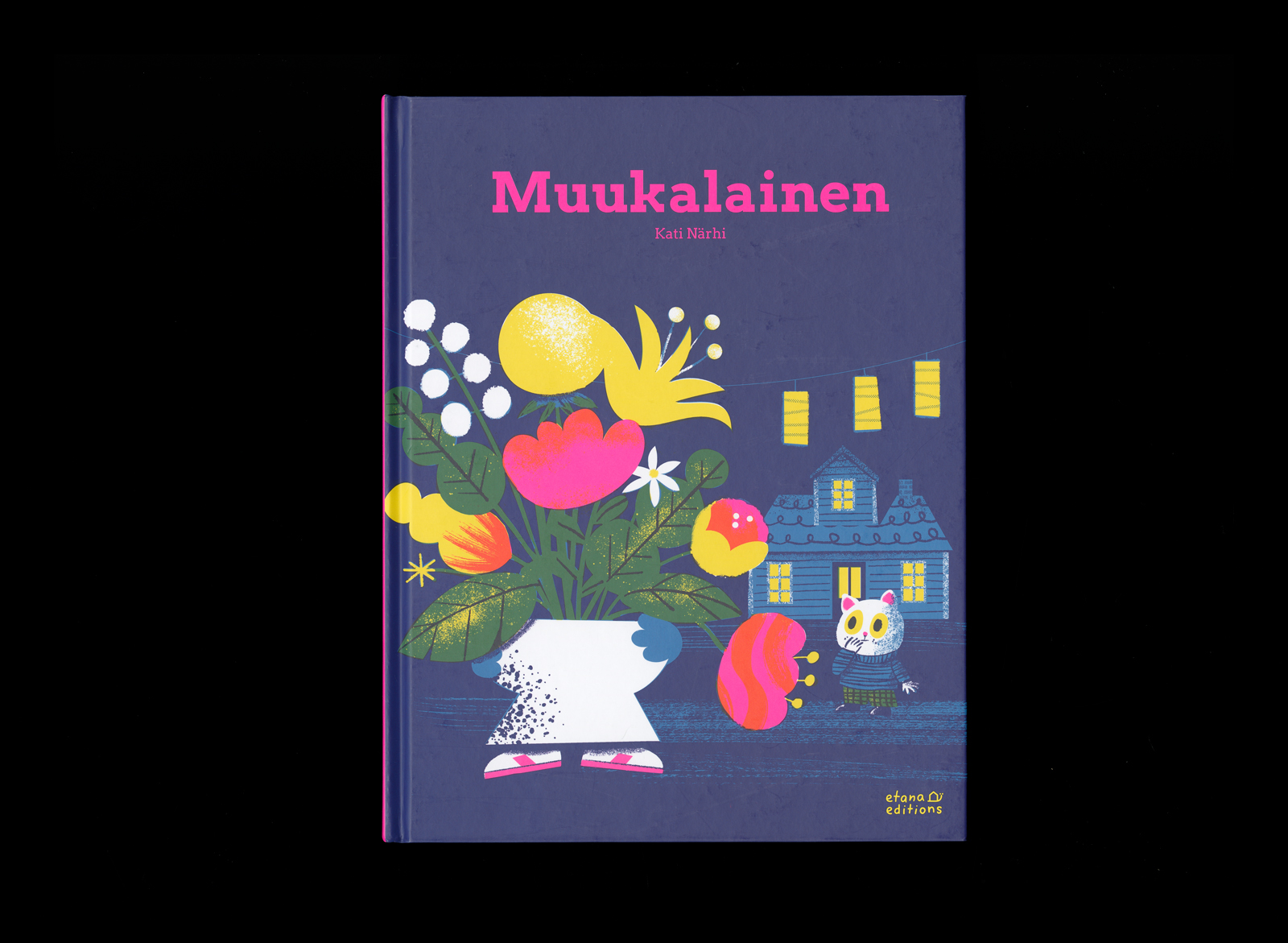
Kati Närhi
Muukalainen
- Format 210 × 270 mm
- Pages 36
- Printing Jelgavas Tipogrāfija
- Paper Amber Graphic FSC
- Typefaces Libre Baskerville, Arvo
- Published by Etana Editions
- Design Kati Närhi, Jenni Erkintalo
- Illustration Kati Närhi
The book’s colour scheme is an exciting artistic feat, where the brilliance of the colours and the textures of the illustrations are brought to their full potential. The typography is thoughtfully designed, with carefully chosen type and colour tones that beautifully support the story unfolding across the dark pages. The book feels fresh and contemporary, while gently evoking a sense of nostalgia.