Kustaa Saksi
Cosmos
- Published by Garret Publications
- Graphic design Pekka Toivonen
- Other designer and illustration Kustaa Saksi
- Photography Jussi Puikkonen
- Reproduced, printed and bound by Jelgavas Tipogrāfija
- Paper Munken Pure Rough 150 g/m2, Savanna 5020 Ivory, Efalin New–Linen
- Typeface Jannon Text OSF, Folio
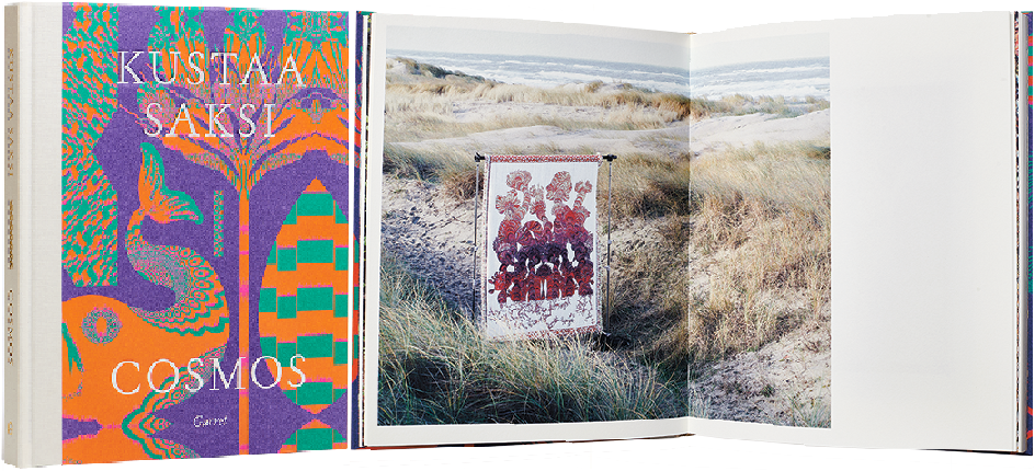
The vibrant colour scheme on the cover is a beautiful gateway to the world of Kustaa Saksi’s works. The title, which has been tooled on the cover with white foil embossing, sinks deep into the material, creating a textile-like effect. The layout is airy and poetic; the texts are beautiful to look at and clear to read. However, the reproduction of the images leaves something to be desired for those who have seen Saksi’s works in person: the colours are faded and the exquisite quality of the weaving is lost.

Sheung Yiu
Everything is a Projection
- Published by The Eriskay Connection
- Graphic design Emery Norton
- Photography Sheung Yiu
- Reproduced, printed and bound by Wilco Art Books
- Paper Arctic Volume White, Munken Print White, Grenita
- Typeface Pirelli
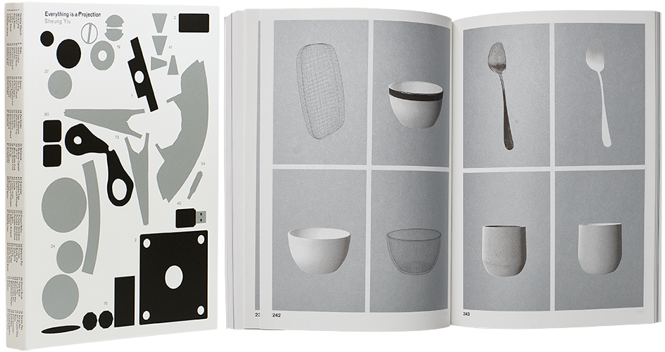
The artist’s multiphase and conceptually complex process is presented with a well-considered laconism and with elegant graphic techniques. The choice of materials and printing ink has resulted in a book object that no longer simply frames the work, instead becoming the work’s very means of existence. The combination of silver printing ink and uncoated, high-bulk paper creates a dissonance that references the virtual, which, along with the unassuming nature of the final climax, is a particularly enjoyable detail.

Aapo Huhta
Gravity
- Published by Kult Books
- Graphic design Heikki Kaski, Aapo Huhta
- Photography Aapo Huhta
- Reproduced and printed by robstolk
- Bound by Boekbinderij Voetelink
- Paper Condat matt Périgord 135 g/m2 ja IBO One 60 g/m2
- Typeface Rza / Out of the Dark
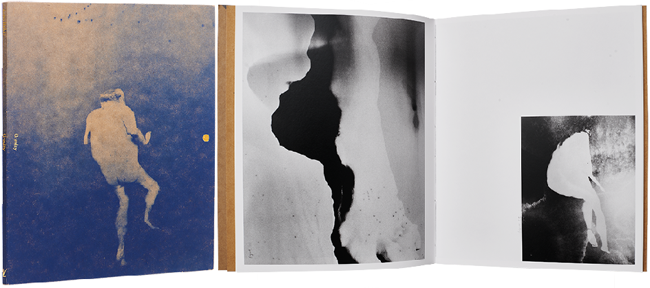
The work’s interesting cover is thin, coarse and unconventional, opening in a tri-fold manner and enclosing a small book inside. The blue images on the container board cover are mysterious: the blue ink brings a magical glow to the images. Inside the covers, the contents are printed on thick photo paper and bound with thick thread between several thin leaves. The result is itself a work of art – an astonishing object that asks to be turned and felt.

Kimmo Metsäranta
Notes on a Place
- Published by Khaos Publishing
- Graphic design Janne Hänninen
- Photography Kimmo Metsäranta
- Reproduced by Petri Kuokka
- Printed and bound by Livonia Print
- Paper Galerie Art Matt 150 g/m2
- Typeface Untitled Sans / Klim Type Foundry
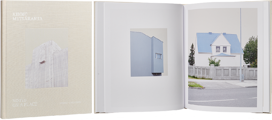
A combination of magically smooth surfaces, sharp outlines and subtle contrasts is repeated in the pictures, the choice of materials and the use of white space. The large format and high-quality printing emphasize the spatiality of the image surfaces and draw the viewer in, but at the same time, the flatness of the surfaces cannot be overlooked. The typographic texture of the epilogue would have benefited from the same subtle warmth evident in the images and cover.

