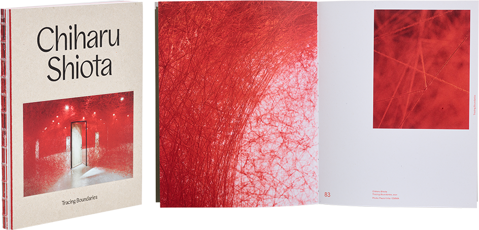
Pilvi Kalhama – Päivi Karttunen – Chiharu Shiota – Arja Miller
Chiharu Shiota Tracing Boundaries
- Published by Espoo Museum of Modern Art
- Graphic design and illustration Tony Eräpuro, Vesa Viljakainen, Kirsi Rauhala
- Photography Paula Virta
- Reproduced by Asko Rokala / BEE2 Oy
- Printed by Grano Oy
- Bound by Finnreklama Oy
- Paper Nautilus Classic 160 g/m2
- Typeface Favorit / Dinamo, Rascal Grotesk / No Bad Type
The foundation of the work’s visual identity is a strong red colour – from the cover image to the red thread of the open-spine binding and the use of red in the layout. The red thread of the artist’s work is also the red thread of the book. At times the fine artwork sinks into the red background, but perhaps this was intentional.
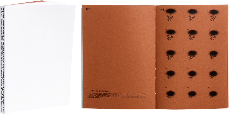
Sheung Yiu
Ground Truth
- Published by The Eriskay Connection
- Graphic design Emery Norton
- Photography Sheung Yiu
- Printed, reproduced and bound by Wilco Art Books
- Paper Munken Lynx Rough, Kriebcoat
- Typeface Pirelli
The almost imperceptible image of a forest on the cover, in shades of white, makes you stop and turn the book in your hand. The sketch-like marks on the back cover add to the mystery, and the explanation of the book’s contents is cleverly left to the text on the back. The work is perfectly balanced in terms of proportions and layout, and the heavy weight and tone of the paper and the rhythm of the laid-out images are a treat. The book overflows with high-quality and inventive typographic solutions, resulting in a first-class design that captivates the reader. A powerful minimalist masterpiece.
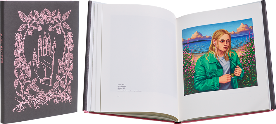
Virpi Nikkari – Marjut Villanueva – Joel Slotte (eds.)
Joel Slotte – Vuoden nuori taiteilija 2021
- Published by Tampere Art Museum
- Graphic design Mako Niemelä
- Illustration Joel Slotte
- Photography Clas-Olav Slotte, Joel Slotte
- Reproduced by Kari Lahtinen
- Printed and bound by Grano Oy
- Paper Munken Lynx Rough 120 g/m2, Arctic Volume Ivory 150 g/m2
- Typeface Postamt, Minion Pro
The brave, textless cover is inviting, its pink line drawing arousing curiosity. The delicate colours of the endsheets complement the overall style, and enigmatic drawings lead the reader into the book. The large size feels just right for this work. The pages are pleasantly spacious, and elegant details contribute to a high-quality design.
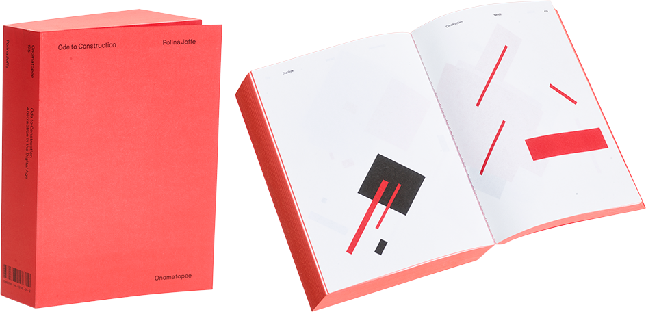
Polina Joffe
Ode to Construction – Abstraction in the Digital Age
- Published by Onomatopee Projects
- Graphic design and illustration Polina Joffe
- Printed, reproduced and bound by AS Printon
- Paper Munken Print White 18, 70 g/m 2
- Typeface NB International Pro
Inspired by Russian Constructivism of the 1920s, this impressive work explores the intersections of graphic design and generative art. The book’s typography engages in a dialogue with geometric shapes created by code. The beautifully executed edge painting and imposing redness of the work make for a convincing design. Ode to Construction is an installation, a printed book and a digital tool that anyone can try.
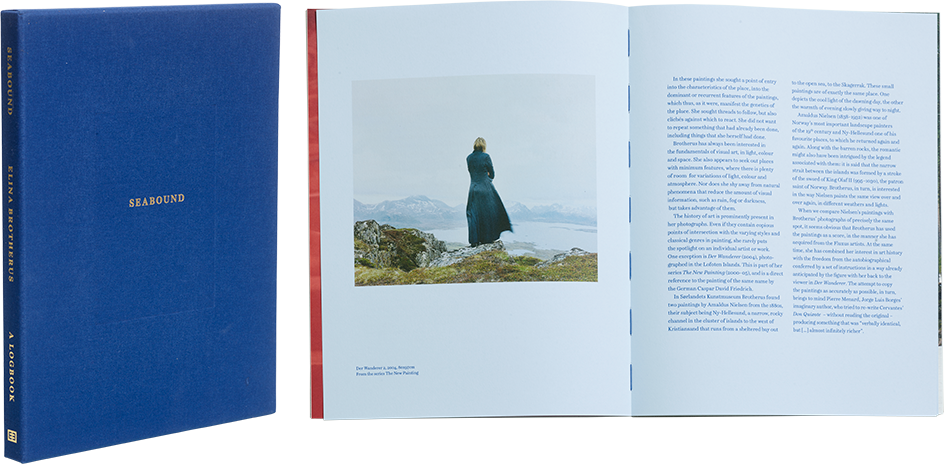
Elina Brotherus
Seabound. A Logbook
- Published by Kehrer Verlag
- Graphic design Ilona Ilottu
- Illustration and photography Elina Brotherus
- Reproduced by Petri Kuokka / Aarnipaja
- Printed by Offizin Scheufele Druck & Medien GmbH + Co. KG
- Bound by Josef Spinner Großbuchbinderei Gmb
- Paper Gmund Ever 80 g/m2 ja 120 g/m2, Keaykolour Pastel Blue 120 g/m2, Fedrigoni Arena Smooth 170 g/m2
- Typeface Schotis
Seabound is a gorgeous, soulful work. A blue cloth-bound slipcase holds a book with a harmonious linen cover and beautifully sewn open spine. The understated blind stamping, tip-on image and materials of the cover invite the reader to embark on a picturesque journey to the seashore. The placement and print quality of the images are excellent; the spreads are vibrant and powerful or breathe calm – like the sea, the inspiration for the work. The specialty paper at the beginning and end of the book enhances the rippling of the sea and brings another haptic dimension to the work. This book is an experience.

