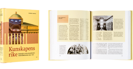
Rainer Knapas
Kunskapens rike. Helsingfors universitetsbibliotek - Nationalbiblioteket 1640-2010
Tiedon valtakunnassa. Helsingin yliopiston kirjasto - Kansalliskirjasto 1640-2010
- Published by Svenska litteratursällskapet i Finland / The Society of Swedish Literature in Finland
- Graphic design Markus Itkonen
- Reproduced by Kari Lahtinen
- Printed and bound by Kariston Kirjapaino Oy
- Paper Arctic Matt 130 g/m2, Geltex
- Typeface Freya, Fjodor
This book, published in both Finnish and Swedish, is an impressive overview of the history of the National Library of Finland, extending over several centuries. The huge and rich set of information in the book includes photographs, reproductions of books, ex libris bookplates and newspapers, and architectural drawings. These are harmoniously arranged and paced on the approximately 450 pages of the book. The book’s red cloth covers and black endpages make up a dignified whole.
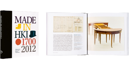
Made in Helsinki
- Published by Helsinki City Museum
- Graphic design Dog Design
- Photography István Bolgár, Juho Nurmi
- Reproduced by BEE2 Oy
- Printed by Aldus Oy
- Bound by Finnreklama Oy
- Paper Galerie Volume 1.1 135 g/m2
- Typeface Utopia Std
Harbinger staff, heteka bed, whistle braid, women’s graduation cap and Iisibiisi overalls are among the pearls of Helsinki crafts. Made in Helsinki is a confidently built package – richly illustrated, clearly outlined, carefully laid out, printed and bound. It offers new information on Helsinki’s history of design in an easy to understand form.
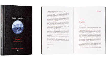
Valdemar Melanko
Puistohomot
- Published by The Finnish Literature Society
- Graphic design Timo Numminen
- Printed by Kariston Kirjapaino Oy
- Paper MultiDesign Ivory 130 g/m2
- Typeface Scala, Futura
The black, pocket-sized notebook with rounded corners shows a peephole into a windy landscape where gentlemen meet in a somewhat blurred image. The visual techniques in the book skillfully create an impression of documentary film and the sometimes even harsh esthetics of newspapers and official reports. The mostly black and white typography is elegantly spiked with clever use of red, which subtly reflects the private nature of the letters.
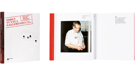
Harri Pälviranta
Toden tuntua galleriassa
- Published by Aalto ARTS Books / Musta Taide
- Graphic design Jyri Konttinen
- Photography Harri Pälviranta
- Printed by Otavan Kirjapaino Oy
- Paper Galerie Art Matt 150 g/m2, Cyclus Offset 115 g/m2
- Typeface Vendetta, Caslon Fina Stencil, Nimbus Sans
In this book that deals with violence the visual style supporting the theme – the illustrations themselves, the strong red color and the fragmented typography – is finely balanced with the classically refined layout of the text. Enough space has been left white, like in the gallery of its context. The materials are pleasant. The exhibition panoramas, extending to four pages, the coloring of the page edges and the bullet holes on the cover render a fine appearance first rate.
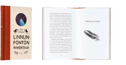
Jyrki Vainonen
Linnunpöntönrakentaja
- Published by Atena Kustannus Oy
- Graphic design Elina Warsta / Solmu
- Printed and bound by Bookwell Oy
- Illustration Elina Warsta
- Paper Edixion 100 g/m2
- Typeface Filosofia
Written with heart and soul, a warm and endearing little book about birds and bird boxes. The round hole in the cover looks as if it was made for a coal tit to fly through. The bird eggs on the front endpages have hatched when we reach the end. The book’s cloth spine and gray cardboard cover reflect the spirit of the book nicely.
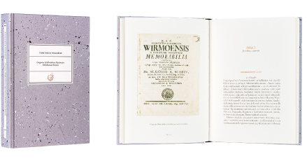
Toivo Viljamaa (Suom.)
Territorium Wirmoënse. Gregorius Halleniuksen Mynämäen kihlakunnan kuvaus
- Published by Maahenki Oy
- Graphic design Patrik Söderlund
- Photography Heli Konttinen, Pekka Heikkilä
- Printed by Kariston Kirjapaino Oy
- Paper Munken Pure 150 g/m2
- Typeface Adobe Garamond Pro
The elegant cover with its graphic reminisces of drizzle painting and folder label tempt the reader to take this book in hand. The gentle paper material, the scarce but warm color scale, the stylish, old-fashioned, Antiqua-based typography and careful layout lead the reader into a historical journey to Mynämäki. The beautiful reproduced illustrations offer delightful glimpses in between the text mass. The old maps and also typographically exquisite documents are simply fascinating.

Anna Blom - Mikaela Friis - Siri Liukkala - Sari Pukonen
Megafon 1 Textbok
- Published by Otava Publishing Company Ltd.
- Graphic design Sari Inandik
- Illustration Kalle Talonen
- Reproduced by Aste Kirjat Oy
- Printed and bound by Otavan Kirjapaino Oy
- Paper Edixion 90 g/m2
- Typeface Caecilia LT Std, Blackadder ITC, Ashcan
The book takes on the task of making the study of Swedish fun and inspiring. The visual appearance of the book meets the challenge well. It includes lots of photographs, drawings, colors and graphic surfaces, while the text pages are wisely left on a white background. The layout has a splendid rhythm and dynamics. The typography is relaxed and at the same time logical, while smartly restricted to just a few typefaces. More than mandatory reading!

