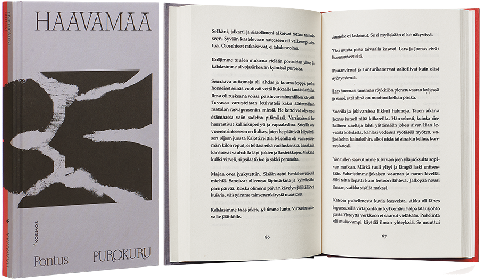
Pontus Purokuru
Haavamaa
- Published by Kustannusyhtiö Kosmos
- Graphic design Nina Grönlund
- Photography Meri Björn
- Reproduced by Keski-Suomen Sivu
- Printed and bound by Scandbook
- Paper Enso Creamy
- Typeface Palatino LT Std
The book’s dramatic exterior and its title, Haavamaa (Wound Land), are a perfect pair. The reversible format book has two covers, red and grey – the cover illustration ties them together, and the alluring work is topped off with skilfully chosen typography.
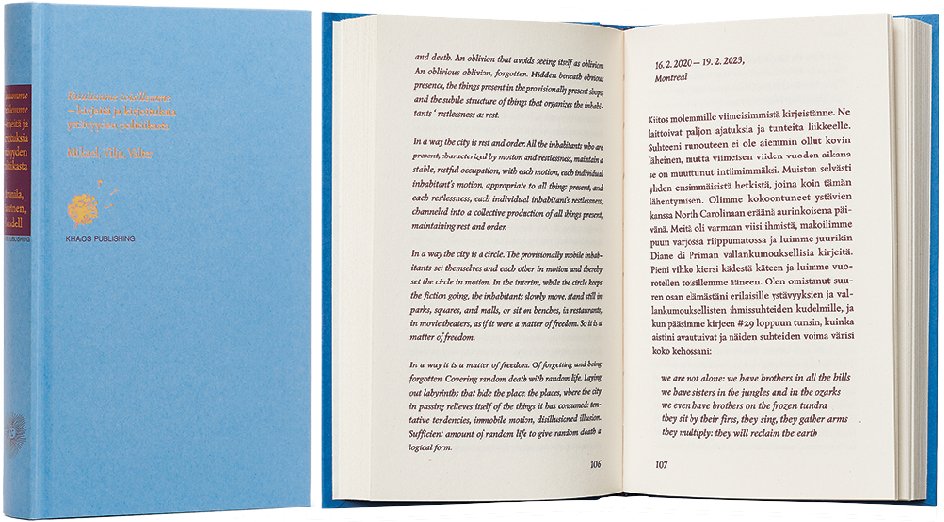
Mikael Brunila – Vilja Saarinen – Valter Sandello
Kuulumme toisillemme – kirjeitä ja kirjoituksia ystävyyden politiikasta
- Published by Khaos Publishing
- Graphic design Samuli Saarinen
- Printed and bound by Printon
- Paper Holmes Book Cream 2.0 70 g/m2
- Typeface Lazurski, Lacrima Senza
This book is a small treasure whose riches are only apparent from a close distance. The intimate result serves both the content and the reader. As an object yearning for its future past, one hopes to find this book on the shelf years and even decades from now.
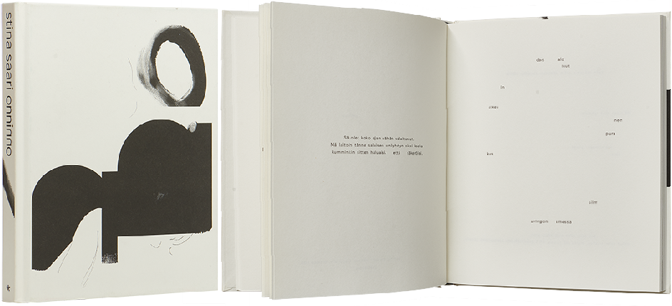
Stina Saari
Onninno
- Published by Kustannusyhtiö Kosmos
- Graphic design Arja Karhumaa
- Illustration Stina Saari
- Reproduced by Keski-Suomen Sivu
- Printed and bound by Livonia Print
- Paper Munken Print Cream
- Typeface Jungka Book, Freight Text
A perfect book of poems, down to the smallest detail – the embossing on the cover, barcode, typography on the spine, publisher’s logo… The author’s distinctive poetry has been given a distinctive and sophisticated visual form. The airy, lively and diminutive typography gives space and weight to the words. Fingerprints and handwritten texts combine nicely with the sign-like illustration.
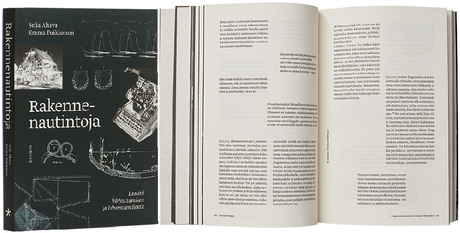
Selja Ahava – Emma Puikkonen
Rakennenautintoja. Esseitä kirjoittamisen ja lukemisen ilosta
- Published by Kustannusyhtiö Kosmos
- Graphic design Anna-Mari Tenhunen
- Photography Meri Björn
- Reproduced by Keski-Suomen Sivu
- Printed and bound by Scandbook
- Paper Enso Creamy
- Typeface Greta Text Pro, Neue Montreal
The layout intertwines and breaks up narrow columns of text, embodying the text without falling into oversimplifications. The lightness of the visual elements outside the columns directs the reader’s attention to the book’s insights. The choice of paper is sensibly thin, and the book is therefore lighter than its number of pages would suggest.
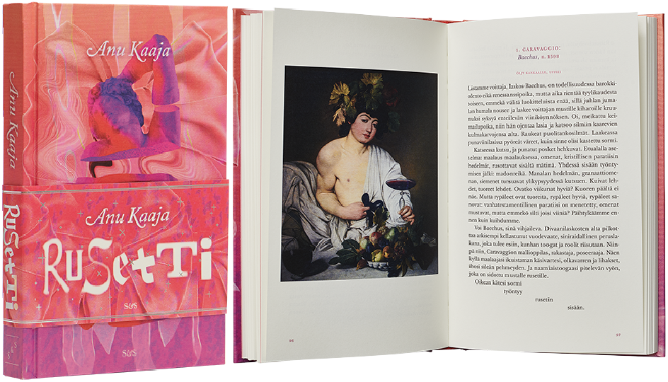
Anu Kaaja
Rusetti
- Published by Kustantamo S&S
- Graphic design Jenni Saari
- Printed and bound by Jelgavas Tipogrāfija
- Paper Munken Pure 120 g/m2
- Typeface Herculanum, Boucherie, Crayonette, Fette Fraktur, Gopher, Colt, Bodoni Std, Adobe Caslon Pro, Altesse Std, Ambroise Std, Baskerville 10 Pro
This delectable pink ensemble immediately arouses one’s curiosity. The unashamedly over-the-top work, with its iridescence, spot gloss and foiling on the wrap-around band, maintains one’s interest. The endpapers are delightful, resembling wallpaper and featuring a beautifully coloured author image on the back endpapers. The colour pages used in the layout have perfect registration. The headings, images, pull quotes and references work – the graphic design is in skilful dialogue with the content.
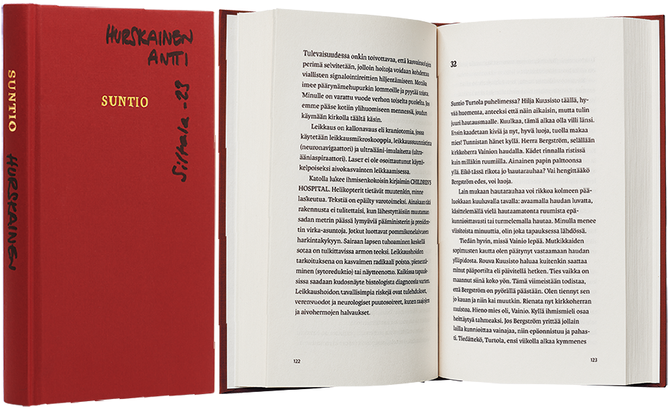
Suntio
Antti Hurskainen
- Published by Kustannusosakeyhtiö Siltala
- Graphic design Aleksi Salokannel
- Printed and bound by Scandbook
- Paper Enso Creamy 60 g
- Typeface Karmina, Karmina Sans
At first glance and touch, the work resembles a hymn book – the size, the colour of the cover, the title discreetly set in a gold-foiled serif font. The author’s name, publishing house and year are defiantly written on the cover by hand in black marker – by the author himself on every copy of the edition. The text flows pleasantly in a narrow, unjustified block. The inexpensive materials, light paper and simple layout are fitting and with their lack of pretension, crown the whole effect.
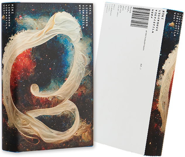
Miki Liukkonen
Vierastila
- Published by WSOY
- Graphic design Jussi Karjalainen
- Reproduced by Keski-Suomen Sivu
- Printed and bound by Scandbook
- Paper Holmes Book Cream
- Typeface Minion Pro
The cover illustration reaches for the unknown and the infinite, but suddenly breaks off. The mechanical typography of the dust jacket guides the reader around the book object and produces pleasant, linear surprises.

